A playfull graphic identity and campaign representing the spirit of kids and play. GL POP!
Brief
Gray Label has been making apparel essentials made from high quality organic cotton for quite some time now. They reached out to us to take a new direction for the launch of a new capsule collection.
Gray Label has been making apparel essentials made from high quality organic cotton for quite some time now. They reached out to us to take a new direction for the launch of a new capsule collection.
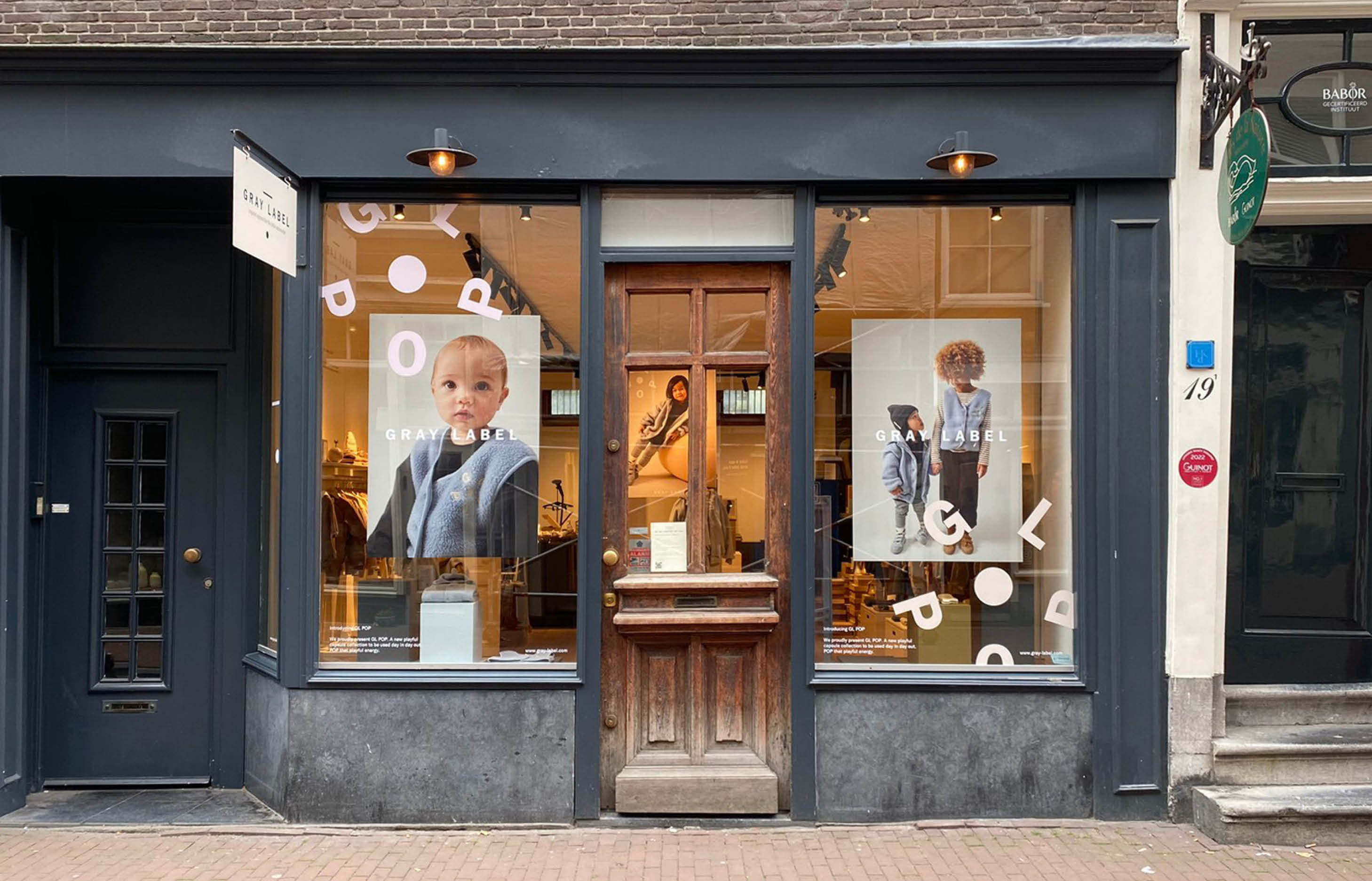
The main objective was to inject this collection with the fun of care free children. Maintaining the DNA of the minimal Gray Label brand. We provided art-direction for visuals and copy, gave the collection it’s name, complimented this with a graphic identity and even collaborated on the actual pieces of the collection which range from vests, hoodies to socks and a custom totebag.
Approach
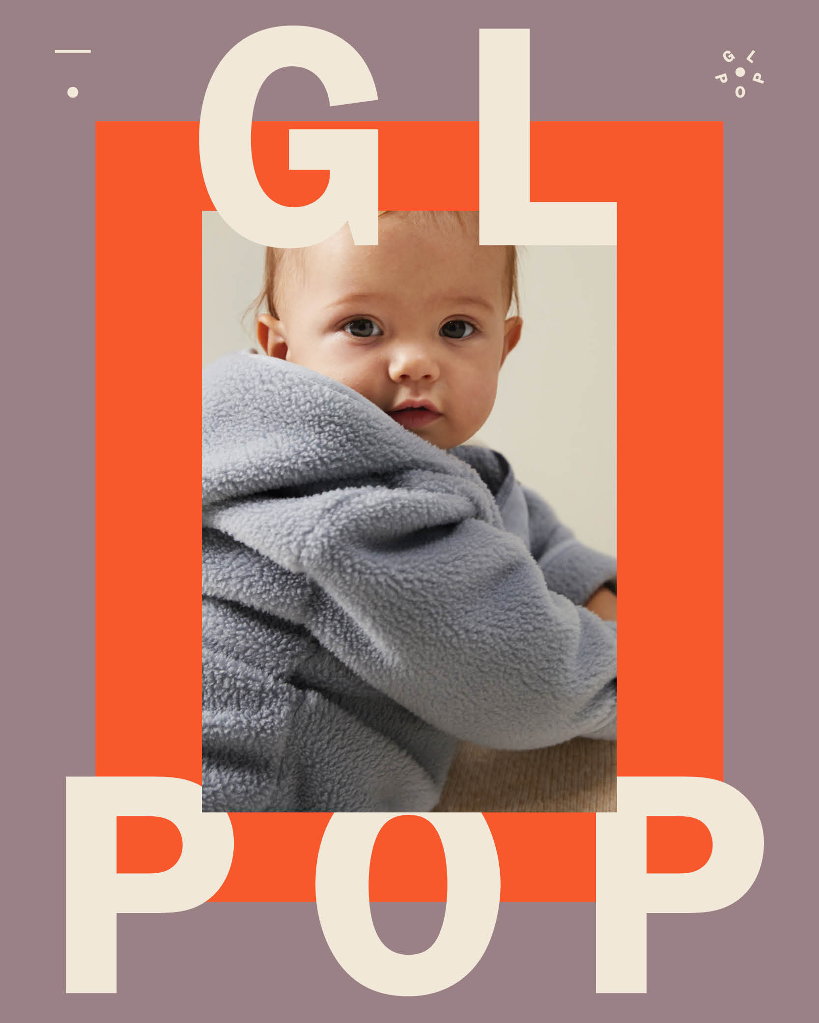
We wanted this collection to ‘pop’. Searching for a catchy and visual brand name that could be combined with ‘Gray Label’. Gray Label POP of GL POP for short.
We wanted this collection to ‘pop’. Searching for a catchy and visual brand name that could be combined with ‘Gray Label’. Gray Label POP of GL POP for short.
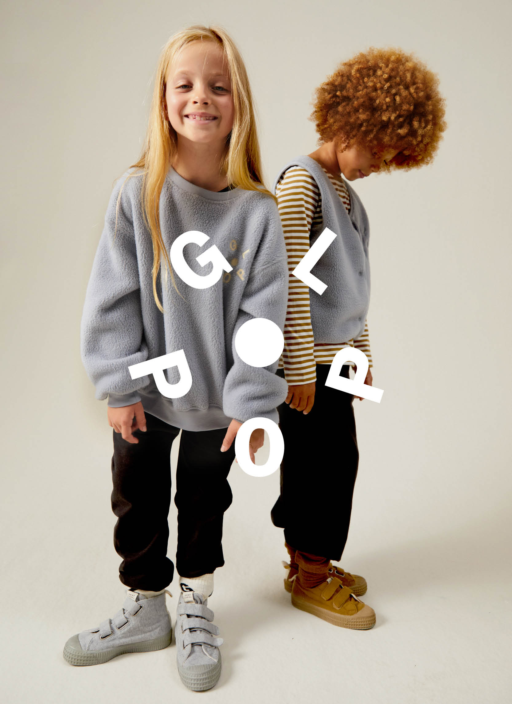
We created a fun logo type that visualises a kid playing, almost cartwheeling. Using the typeface from Gray Label’s own visual identity we were able to create two bold and easily recognizable logotypes.
Lastly we complimented Gray Label’s main colour palette with a vibrant colour universe to go along with photography and the products.
Services:
Graphic design
Art-direction
Storytellig
Graphic design
Art-direction
Storytellig
Released:
Oktober 2023
Oktober 2023


Gray Label POP
Visual identity & campaign
Brief
Gray Label has been making apparel essentials made from high quality organic cotton for quite some time now. They reached out to us to take a new direction for the launch of a new capsule collection.
The main objective was to inject this collection with the fun of care free children. Maintaining the DNA of the minimal Gray Label brand. We provided art-direction for visuals and copy, gave the collection it’s name, complimented this with a graphic identity and even collaborated on the actual pieces of the collection which range from vests, hoodies to socks and a custom totebag.
Approach
We wanted this collection to ‘pop’. Searching for a catchy and visual brand name that could be combined with ‘Gray Label’. Gray Label POP of GL POP for short.
We created a fun logo type that visualises a kid playing, almost cartwheeling. Using the typeface from Gray Label’s own visual identity we were able to create two bold and easily recognizable logotypes.
Lastly we complimented Gray Label’s main colour palette with a vibrant colour universe to go along with photography and the products.
Services:
Graphic design
Art-Direction
Storytelling
Graphic design
Art-Direction
Storytelling
Released:
Oktober 2023
Oktober 2023
We’re always happy to talk about future projects and meet new people, so feel free to get in touch!
We’re always happy to talk about future projects and meet new people, so feel free to get in touch!
+31 (0)6 132 34 132
info@housetmm.com
Hoogt 8, 3512GW — Utrecht NL
Instagram
LinkedIn
Terms & Conditions
©2023
info@housetmm.com
Hoogt 8, 3512GW — Utrecht NL
Terms & Conditions
©2023