Honest and bold.
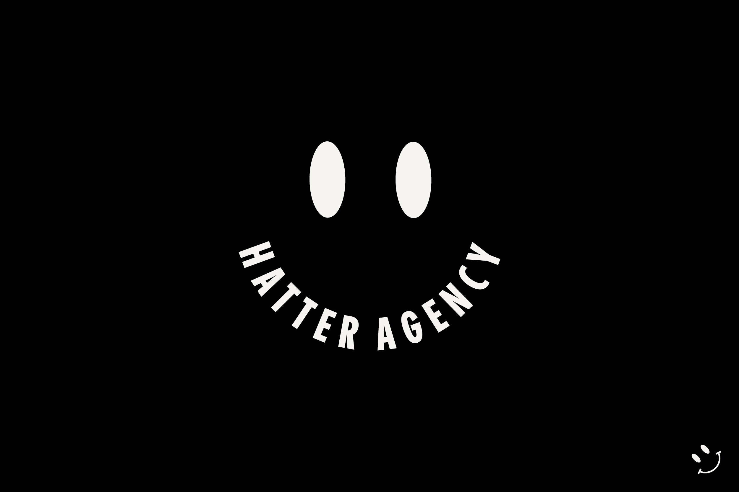
A powerful and clear typographic statement.
A powerful and clear typographic statement.
Brief
Amsterdam based HATTER is a bold and outspoken agency working with brands to achieve meaningfull engagement. Creating spaces, places and experiences.
Amsterdam based HATTER is a bold and outspoken agency working with brands to achieve meaningfull engagement. Creating spaces, places and experiences.
After a solid run with great projects/clients the brand came to a point of self-reflection and reinvention. Trying to capture it’s unique, fun and bold work ethic in a new brand identity and outspoken visual direction.
Approach
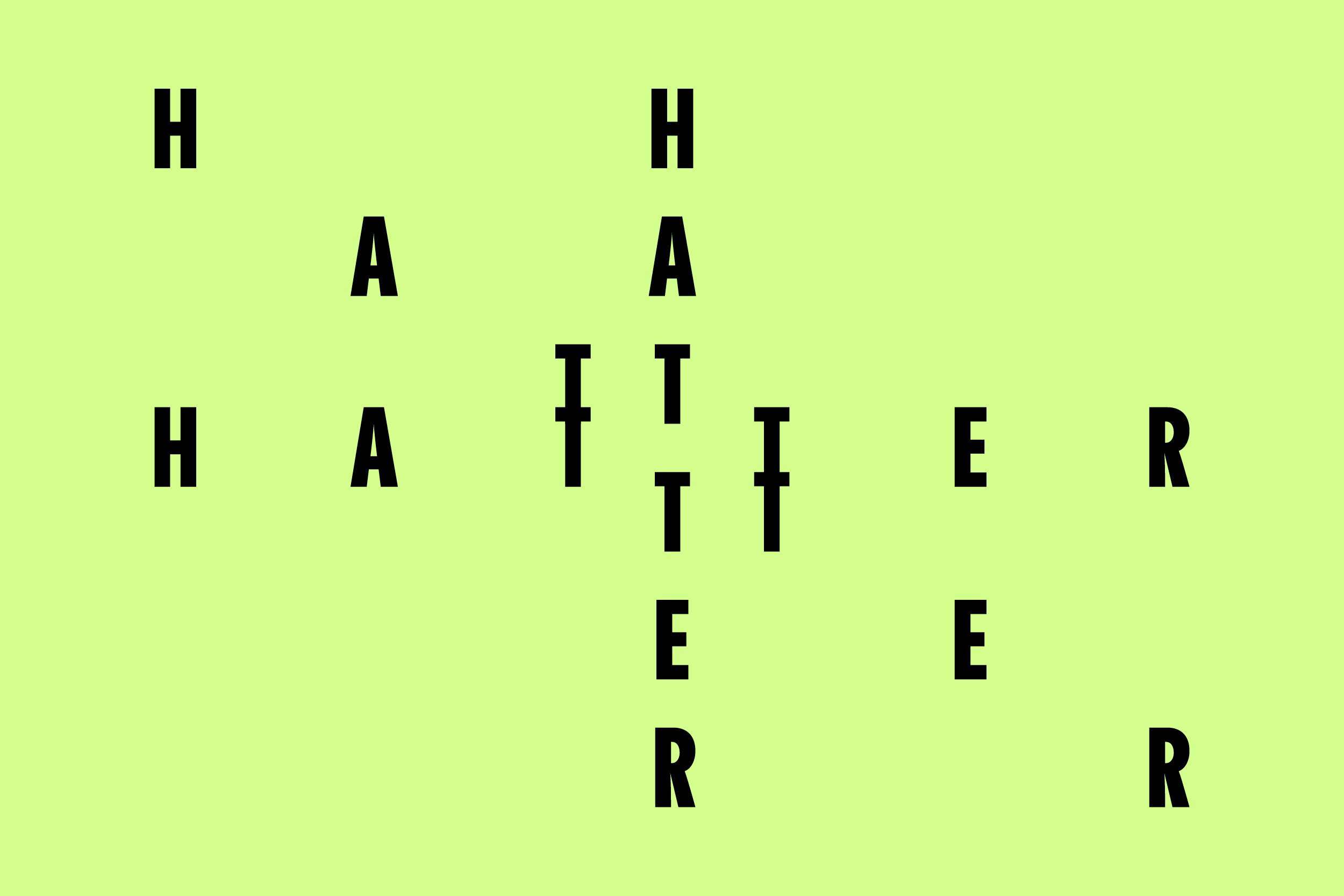
HouseTMM created a visual identity using clear and bold typography to litteraly convey HATTER’s messages. Thoughtfull and powerfull stories and ideas on design, the workfield and society.
HouseTMM created a visual identity using clear and bold typography to litteraly convey HATTER’s messages. Thoughtfull and powerfull stories and ideas on design, the workfield and society.
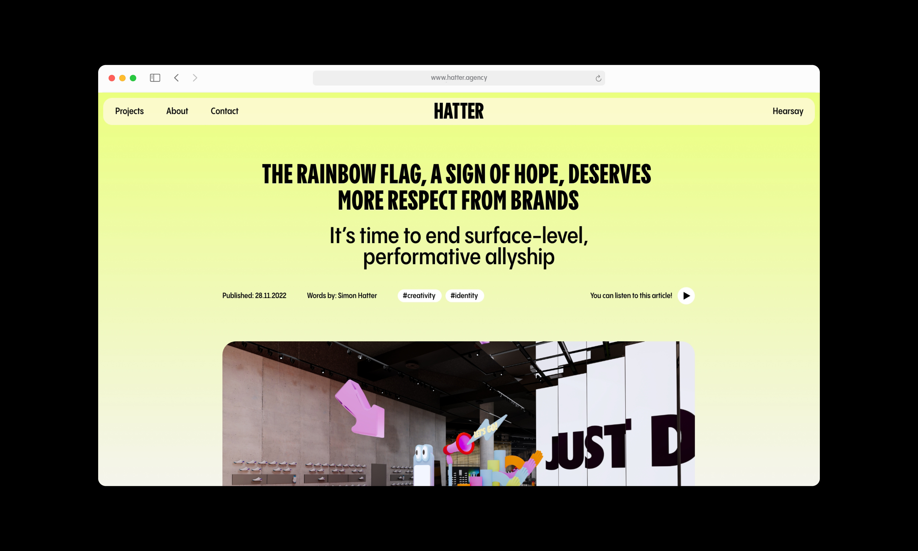
Resulting in colourfull and bright visuals ranging from animated type to small character logo’s. At the center a completely new website to share HATTER’s great output.
Services:
Graphic design
Webdesign
Graphic design
Webdesign
Website development:
Pieter de Jong
Pieter de Jong
Typeface:
Pangram Sans
Pangram Sans
Released:
January 2023
January 2023





HATTER agency
Branding design
Brief
Amsterdam based HATTER is a bold and outspoken agency working with brands to achieve meaningfull engagement. Creating spaces, places and experiences.
After a solid run with great projects/clients the brand came to a point of self-reflection and reinvention. Trying to capture it’s unique, fun and bold work ethic in a new brand identity and outspoken visual direction.
Approach
HouseTMM created a visual identity using clear and bold typography to litteraly convey HATTER’s messages. Thoughtfull and powerfull stories and ideas on design, the workfield and society.
Resulting in colourfull and bright visuals ranging from animated type to small character logo’s. At the center a completely new website to share HATTER’s great output.
Services:
Graphic design
Webdesign
Website development:
Pieter de Jong
Graphic design
Webdesign
Website development:
Pieter de Jong
Typeface:
Pangram Sans
Released:
January 2023
Pangram Sans
Released:
January 2023


We’re always happy to talk about future projects and meet new people, so feel free to get in touch!
We’re always happy to talk about future projects and meet new people, so feel free to get in touch!
+31 (0)6 132 34 132
info@housetmm.com
Hoogt 8, 3512GW — Utrecht NL
Instagram
LinkedIn
Terms & Conditions
©2023
info@housetmm.com
Hoogt 8, 3512GW — Utrecht NL
Terms & Conditions
©2023