A graphic identity based
on space and negative space.
on space and negative space.
Brief
Hopman Ruimtemakers is an interior design and production company focussing on restructuring, designing and developing new office spaces.
Hopman Ruimtemakers is an interior design and production company focussing on restructuring, designing and developing new office spaces.
From design to the actual build Ruimtemakers provides companies with a healthier, more productive and fun office space to give people and employees fresh energy to take on their jobs. H R reached out us to take on their own identity and branding.
Approach
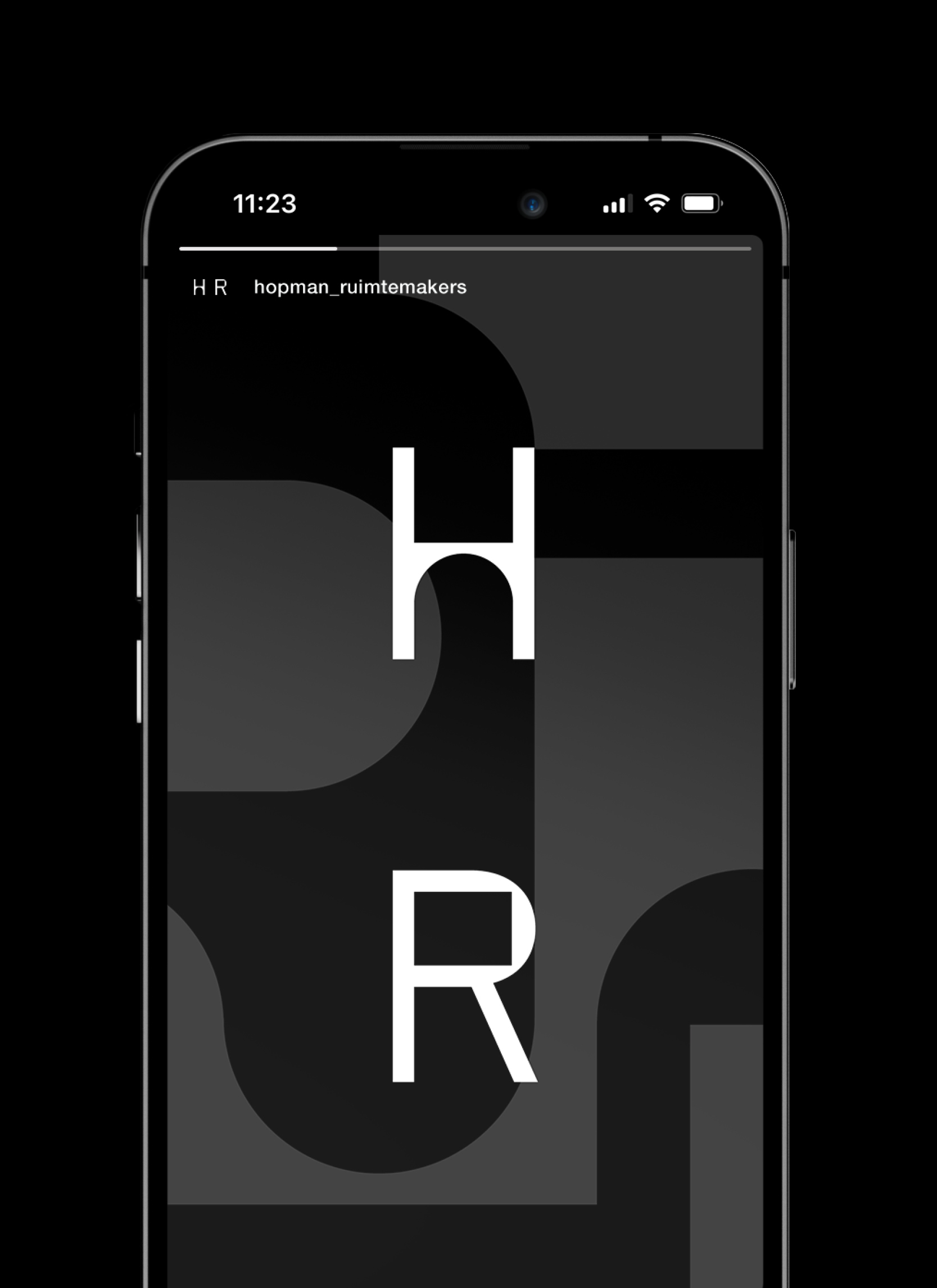
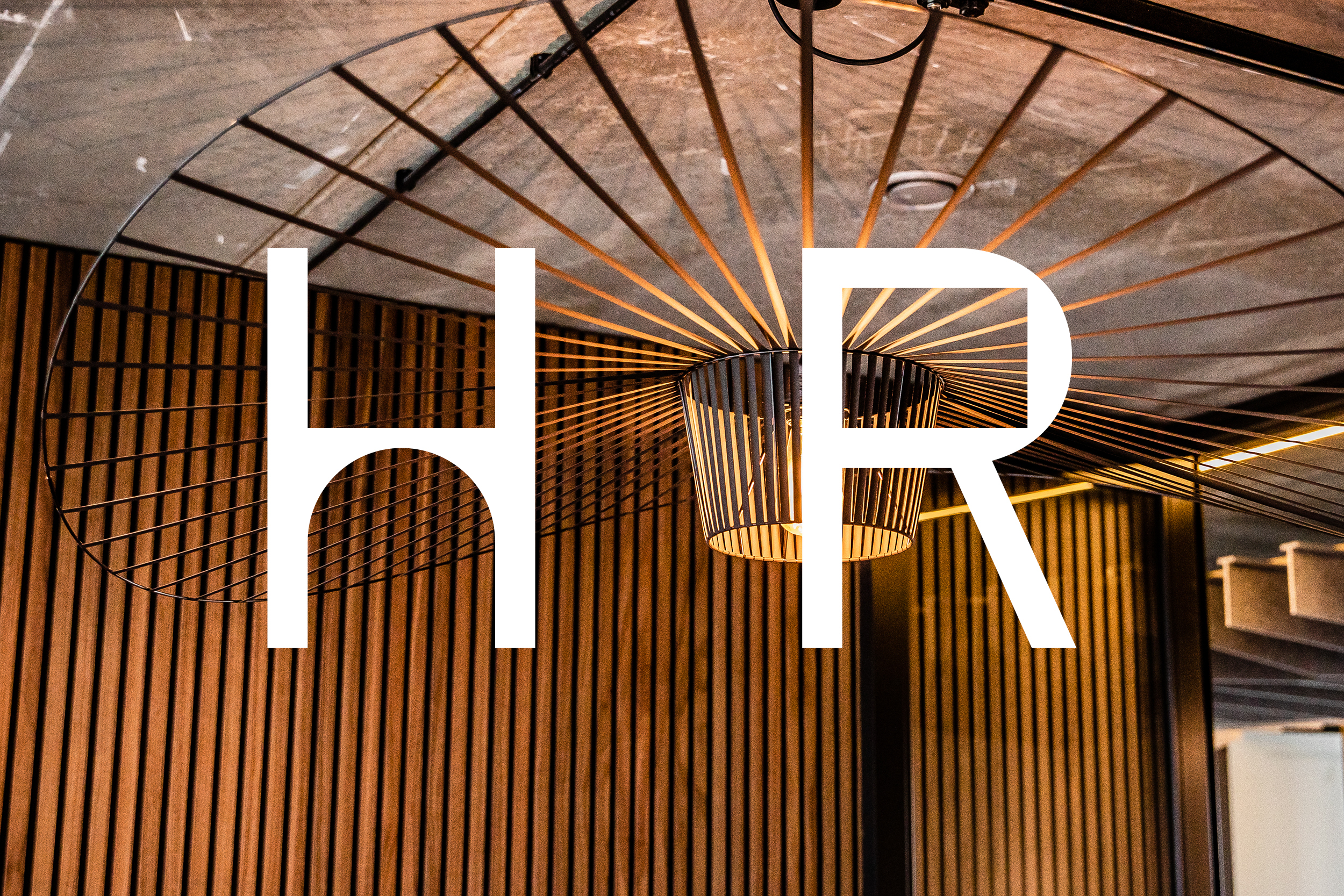
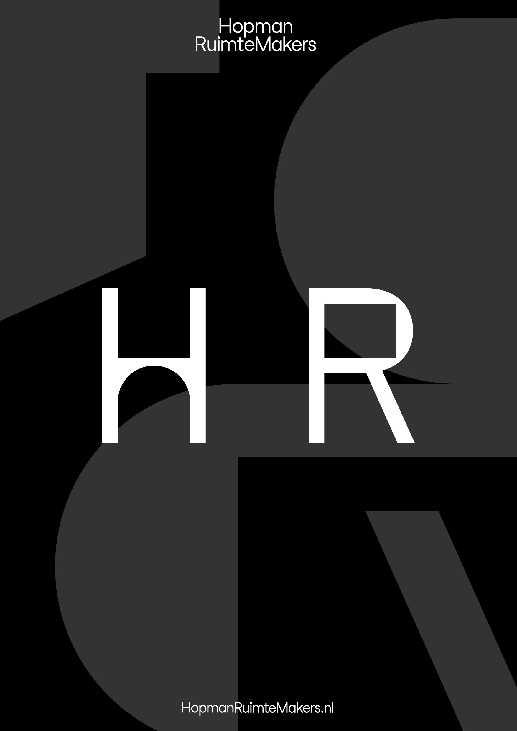
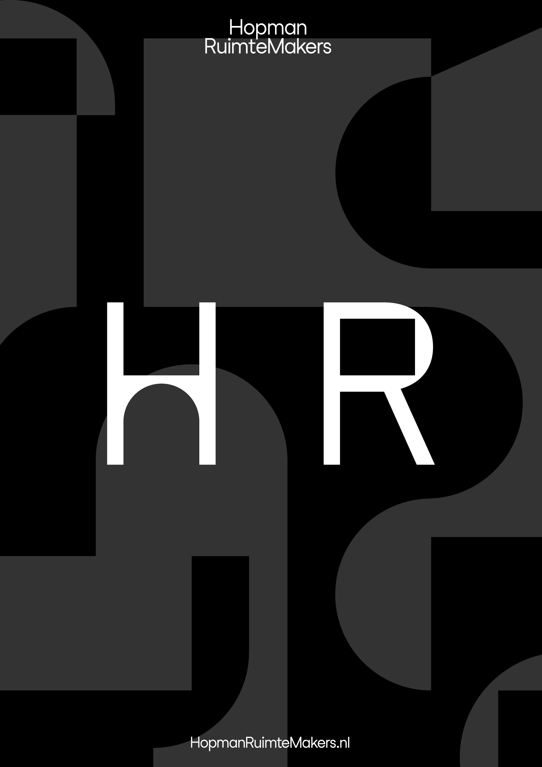
We wanted to create a two dimensional graphic identity that plays with the three dimensional work Ruimtemakers creates. Creating a logo and graphic patterns that play with the viewers perspective on space.
We wanted to create a two dimensional graphic identity that plays with the three dimensional work Ruimtemakers creates. Creating a logo and graphic patterns that play with the viewers perspective on space.
Where the average person might see a square office space H R sees other opportunities. Where one sees walls and borders the other sees walking paths and meeting spots.
Services:
Graphic design
Strategy and story
Webdesign
Graphic design
Strategy and story
Webdesign
Website development:
Pieter de Jong
Pieter de Jong
Typeface:
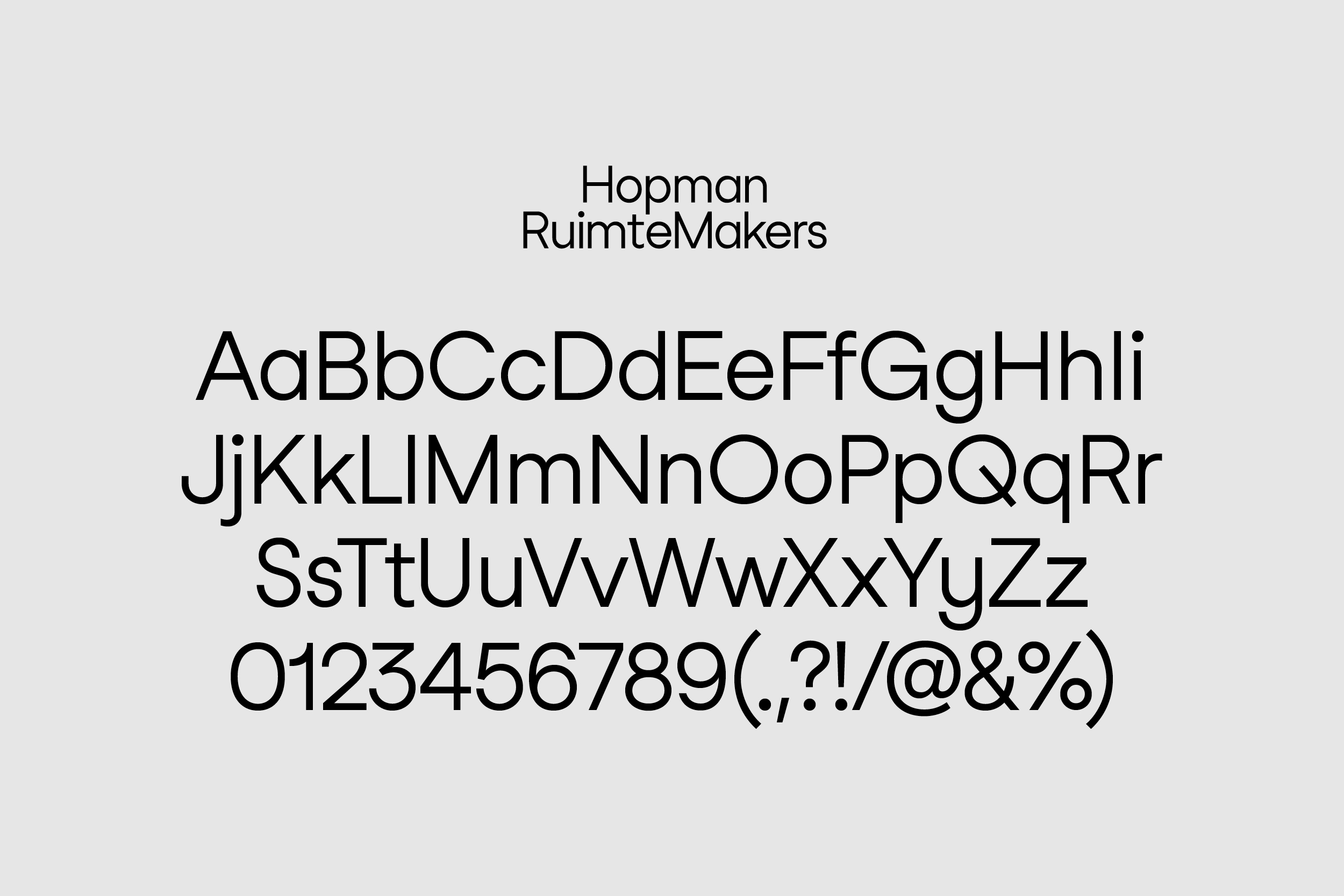
Feixen Sans
Feixen Sans
Released:
July 2023
July 2023








Hopman Ruimtemakers
Visual identity
Brief
Hopman Ruimtemakers is an interior design and production company focussing on restructuring, designing and developing new office spaces.
From design to the actual build Ruimtemakers provides companies with a healthier, more productive and fun office space to give people and employees fresh energy to take on their jobs. H R reached out us to take on their own identity and branding.
Approach
We wanted to create a two dimensional graphic identity that plays with the three dimensional work Ruimtemakers creates. Creating a logo and graphic patterns that play with the viewers perspective on space.
Where the average person might see a square office space H R sees other opportunities. Where one sees walls and borders the other sees walking paths and meeting spots.
Services:
Graphic design
Strategy and story
Webdesign
Website development:
Pieter de Jong
Graphic design
Strategy and story
Webdesign
Website development:
Pieter de Jong
Typeface:
Feixen Sans
Released:
July 2023
Feixen Sans
Released:
July 2023




We’re always happy to talk about future projects and meet new people, so feel free to get in touch!
We’re always happy to talk about future projects and meet new people, so feel free to get in touch!
+31 (0)6 132 34 132
info@housetmm.com
Hoogt 8, 3512GW — Utrecht NL
Instagram
LinkedIn
Terms & Conditions
©2023
info@housetmm.com
Hoogt 8, 3512GW — Utrecht NL
Terms & Conditions
©2023